offer · 14

Alternating photo and text bandsadopted · v14 — re-extraction of the v13 variant "Alternating photo and text bands" for select-offer.md

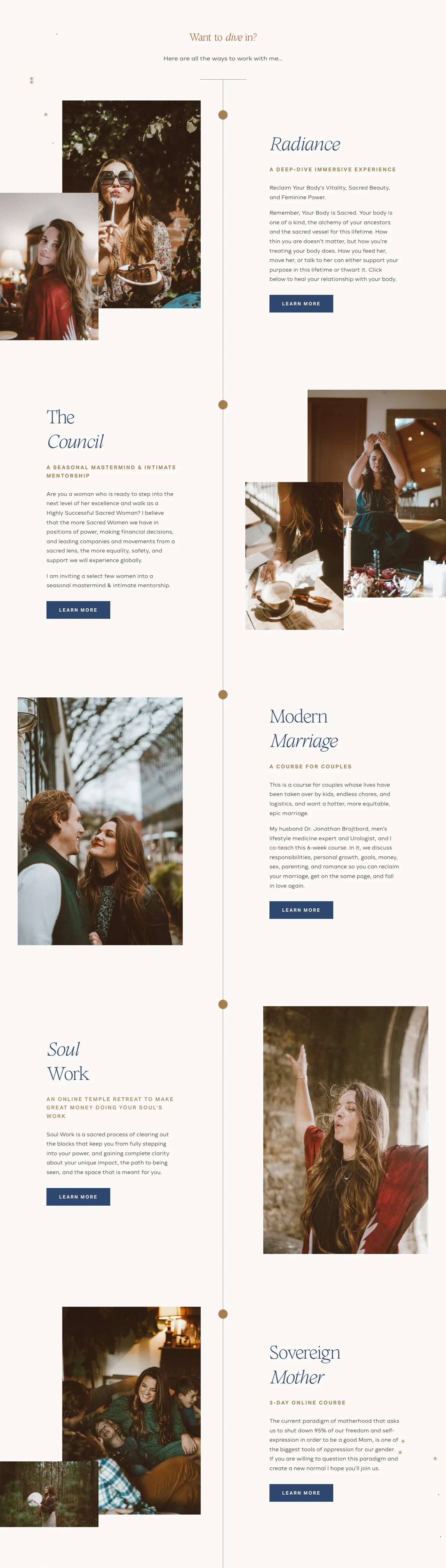
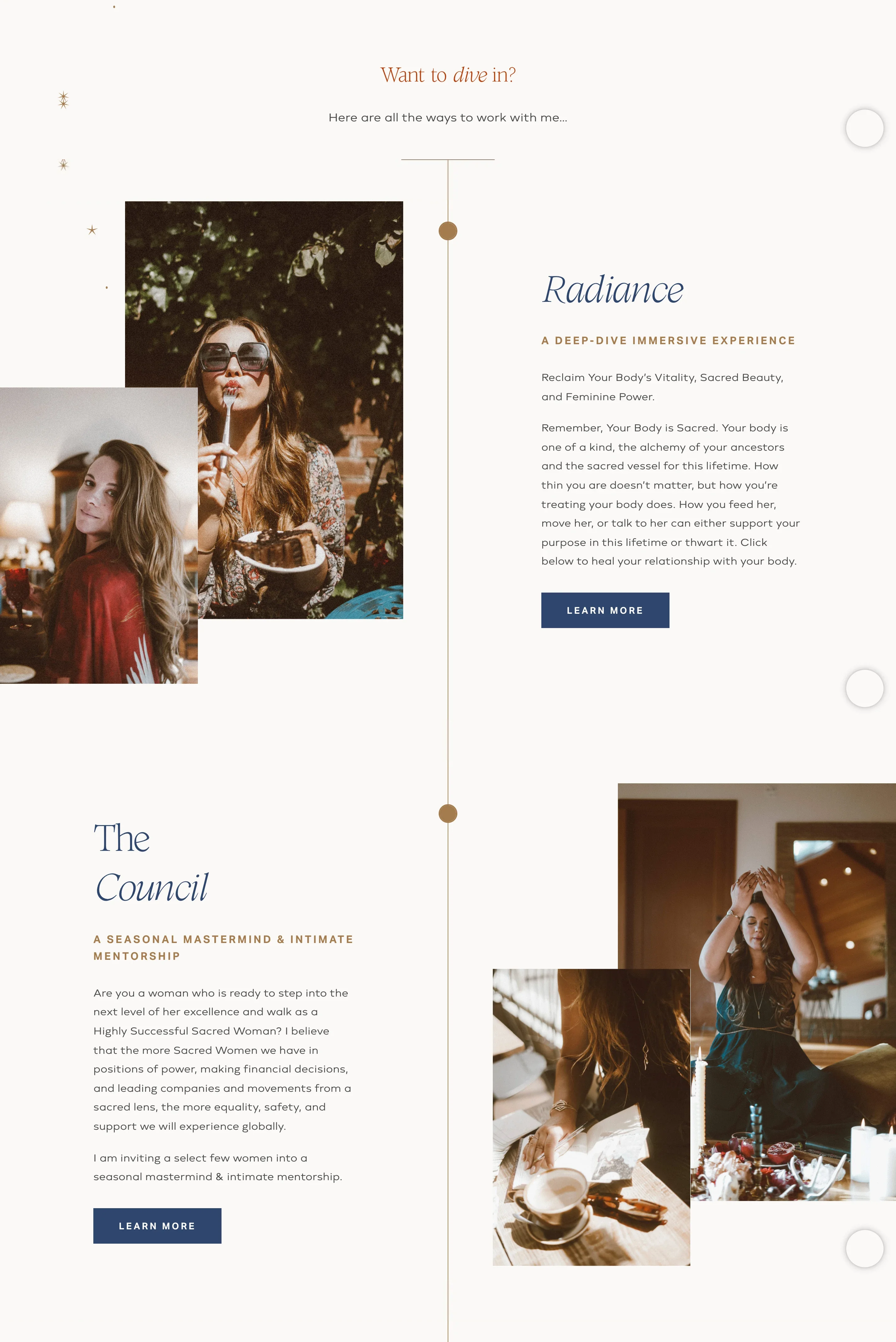
offer · sarahjenks.com · sarahjenks.com "Want to dive in?" — the first two of five offers: references/sarahjenks.com/screenshots/desktop/06.webp (foot), 07.webp and 08.webp, stitched; the 65px under each sticky header filled from full.webp; the chat launcher's disc prints at the right edge. The v13 register's source. The hairline down the centre is the same band's second idea — offer/offers-hung-on-a-spine. Phone: mobile/09–10.
Five offers y5144–10207, 5063px on cream #FAF8F7, 844–997px each; sides alternate strictly — photos L / text R, text L / photos R, photo L, text L, photos L. Three offers carry a two-photo stack: a 447×671 photo behind and a 318×477 (once 318×212 landscape) in front over its lower corner, overlap 118×375 / 118×375 / 119×172, the front photo's top 298 / 296 / 499px below the back one's; in each stack one photo is flush to the viewport edge (x0 or x1439). Two offers carry one 533×800 photo, inboard at x55–589 and its mirror x849–1382 (to within 3px). Text columns x151–562 and x871–1289: name ~64px light on two lines with one italic word, eyebrow ~16px gold tracked caps, ~20px body, one filled navy button. All photos graded alike — darkest 2% at L24–38, never black.
added 2026-09-13

How it looks:

  • Desktop: one long flat band on the page ground, opened by a short centred heading and one line under it, then the offers one under another, each as tall as a screen or a little less. Each offer is split in halves — the photos in one half, the words in the other — and the sides swap with every offer, so the eye zigzags down the page. The words are one column, left-aligned within its half, top to bottom: the offer's name at display scale on two lines, a small tracked eyebrow naming what kind of thing it is, a paragraph, the page's button. The photo half is built one of two ways, and these alternate too: a stack — a tall photo plated behind and a smaller one in front of its lower corner, on the side nearer the viewport edge, one of the two flush to that edge and running off it — or a single tall photo standing inboard of the edge. What differs item to item is only the side and the count of photos; the column, the eyebrow and the button repeat exactly. No rule between offers; the gap between them is ground.
  • Phone: each offer stacks — the photo or the stack first, keeping its overlap, then the name, eyebrow, paragraph and button — and the alternation goes.

Fits: three to six offers, each with a name, a one-line kind, a paragraph and its own photo — at least one photo row tall column per offer, and for the stacks a second row small of a related subject; photos graded alike so the stacks read as one set; the direction warm, photographic, soft or classic.

Not fit: two offers, where the alternation never lands; offers without their own photos; the direction dense, hard-edged or minimal.
Checkerboard of photo and paneladopted · v14 — beside Photo squares with the names on them in select-offer.md

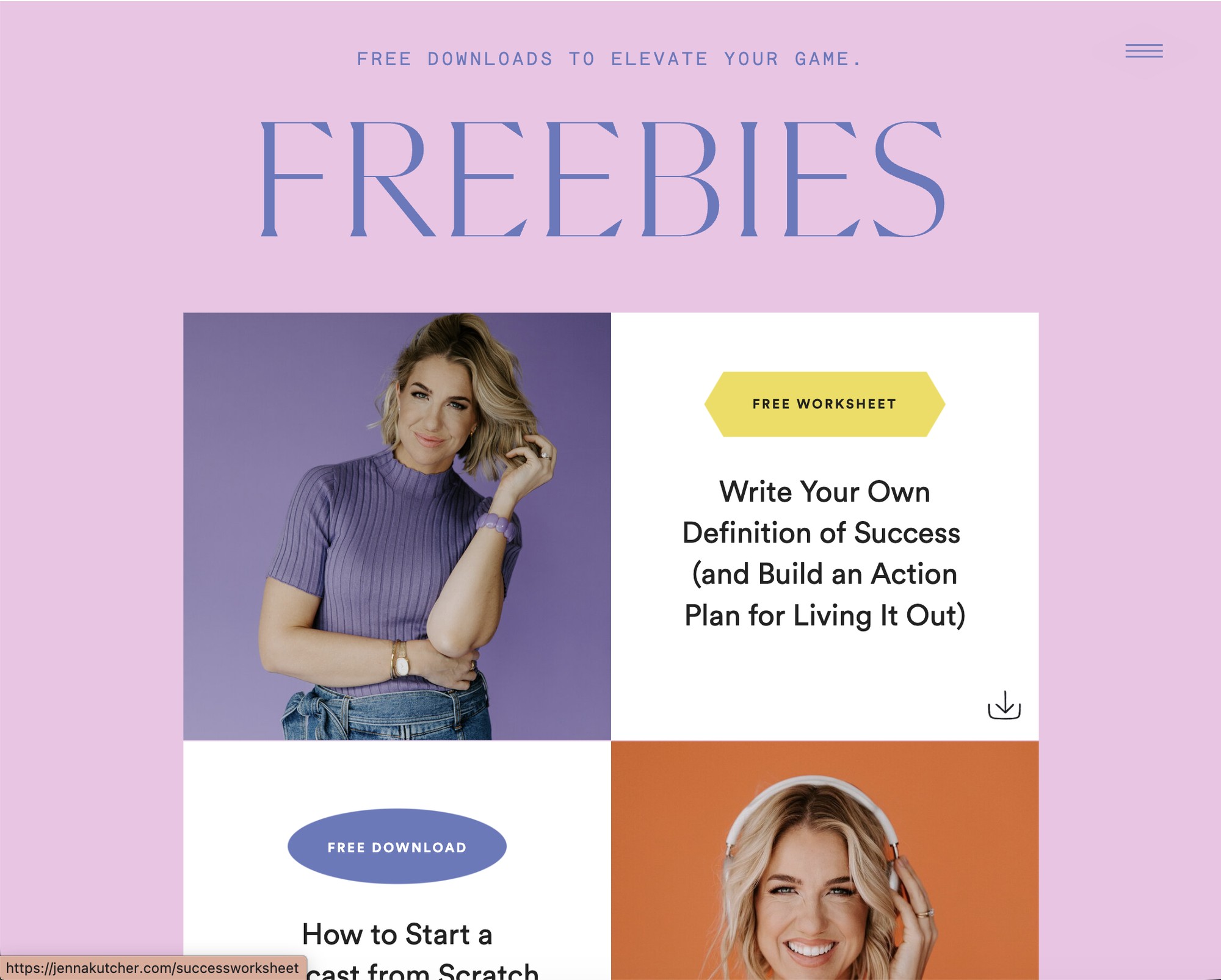
offer · jennakutcher.com · jennakutcher.com freebies — tile 05
840px grid, 420px cells, zero gutter, 300px margins; "FREEBIES" in the didone ~190px; three tags in three shapes — hexagonal banner #F0DB52, ellipse #6579BE, speech bubble #EEC3E5; three backdrops, lavender / orange / warm white.
added 2026-09-13

How it looks:

  • Desktop: an accent band. An eyebrow line and the heading, the largest type on the page, centred at the top. Under them the offers as a two-column grid with no gutter, photo cells and panel cells alternating so no two photos touch. Each photo fills its square cell, plated, flush against its neighbours, on a different backdrop hue so the grid carries the palette without a swatch. Each panel is the page ground and holds, centred: a tag — a small filled shape naming the offer's kind, no two alike in shape or colour — the offer's name at display scale, and a small icon or the page's button in a corner. Sides alternate row by row.
  • Phone: one column, photo then panel, still no gutter.

Fits: two to four offers, each with its own photo row tall column or wider with the subject centred; the direction loud, dense or photographic; a palette with three or more hues.

Not fit: one photo for all offers; long copy per offer; the direction quiet or empty.

Closed rows that openadopted · v14 — rewritten from the v13 variant

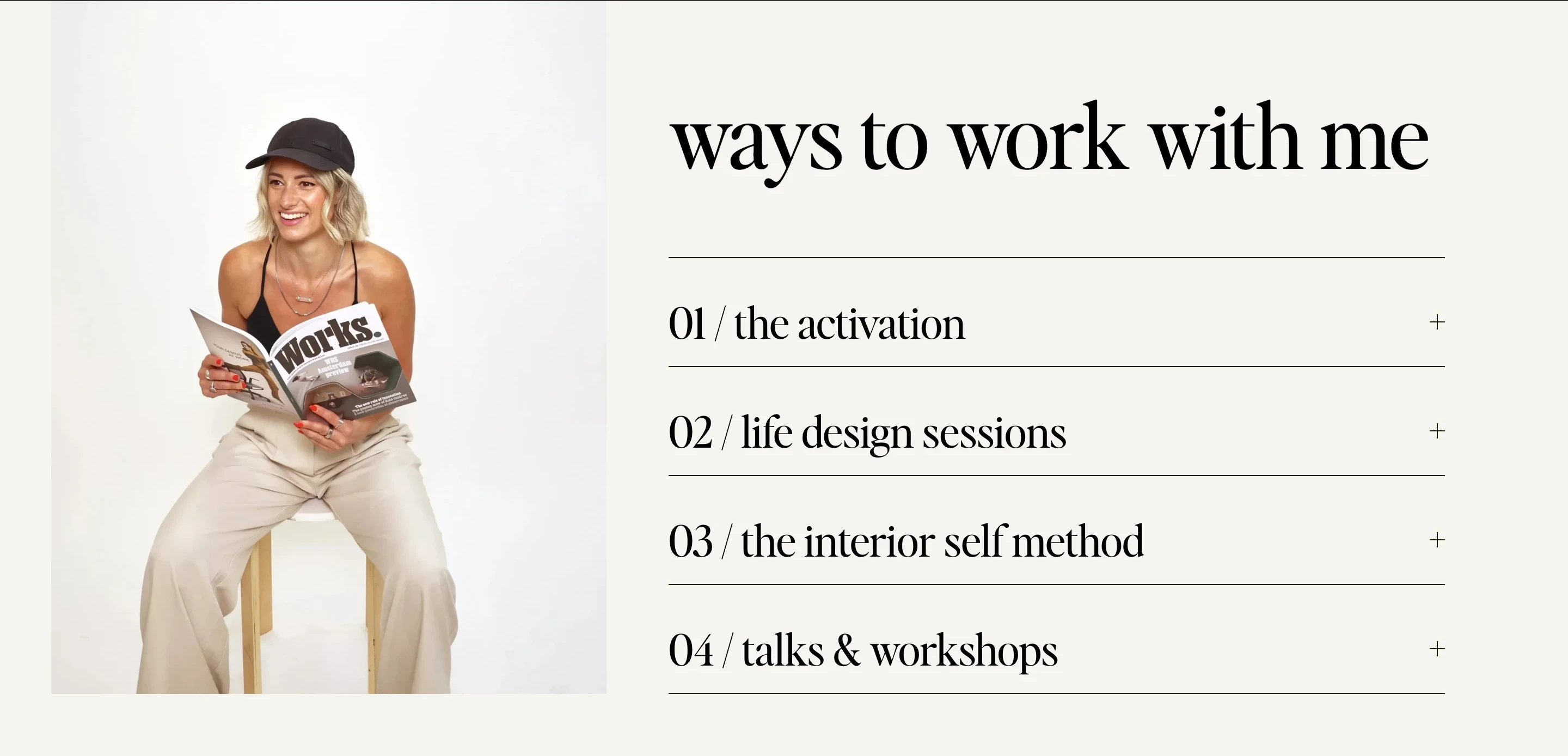
offer · www.interior-self.com · interior-self.com "ways to work with me" — references/interior-self.com/screenshots/desktop/06.webp cropped to the band's top (page y4706; above it the tile holds the pillars band's foot and the fixed header); the band's last 22px of padding fall in tile 07 and are left off. Tiles 06–07 predate the popup that covers tiles 08–11. Phone: the mobile tiles are under the popup from 04 on, so the phone shape is read from mobile/full.webp (y≈6450–7250). The v13 register's source.
Band 716px on off-white #F5F4F0. Portrait ~511×632 at x≈47, its white-cyc backdrop a few units lighter than the ground, so the plate's edge only just reads. Right column x614–1327 (713px): heading 75px serif, left-aligned, a 1px rule under it; four `accordion-item`s, all closed, five 1px rules at y4942, 5042, 5142, 5242, 5342 — a 100px pitch; each row "NN / name" at ~40px serif with a plus sign at the right edge; no price, length or format visible. No button in the band — the black pill above it is the pillars band's. The last rule sits level with the portrait's foot. Phone: the portrait shrinks to a small centred picture (~100px wide) above the heading; the rows go full width. v13's What line is right about the rows, the plus sign, the pitch and the plated portrait; it omits the heading over the rows in the same column and the numerals, and its "Use when: the direction dense" does not describe the source, an airy band of ground and hairlines.
added 2026-09-13

How it looks:

  • Desktop: flat, on the page ground, split in halves. The portrait holds the left half, plated on a backdrop so close to the ground that its rectangle barely reads, touching no edge of the band. The right half is one column: the section heading at display scale, the largest type on the band, left-aligned, with a hairline under it; then the offers as closed rows at one pitch, each a two-digit numeral and the name at the left and a plus sign at the far right, a hairline under every row. Nothing else shows until a row is pressed and it opens to its body. The last rule sits level with the portrait's foot. No action in the band.
  • Phone: the portrait first, shrunk to a small centred picture; the heading under it, then the rows at full width.

Fits: four to six offers, each with a name and a paragraph the surface need not show, so the copy can be long; one portrait row tall column whose caption names a plain backdrop close to the ground, so it sits edgeless beside the rows; the direction quiet, classic or contemporary.

Not fit: fewer than three offers, which leave the portrait tall and alone; offers a stranger must compare at a glance — prices, lengths, formats — since a closed row states none; the direction loud or dense.

Heading in its own column, two tall photos besideadopted · v15 — select-offer.md, sits beside Photo squares with the names on them, and beside Rows in the right half, the left empty for the empty first column

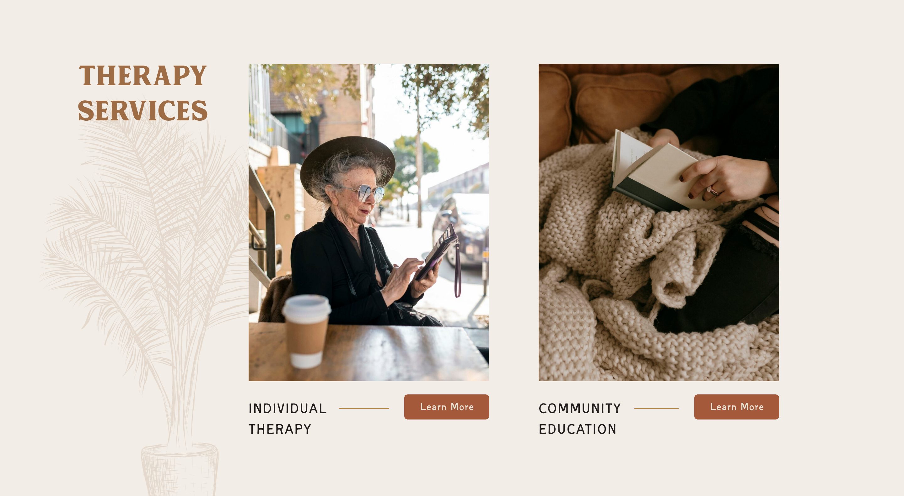
offer · thevibranttapestry.com · thevibranttapestry.com "Therapy Services" — band 05 of gallery/_inbox/thevibranttapestry.com (2026-09-13 sections capture, second polite pass approved by Andrew); the phone from references/thevibranttapestry.com/screenshots/mobile/04.webp and 05.webp
Band 05 y3013–3804 (791px) on #EAE1D5. 'THERAPY SERVICES' ~44px serif caps in tan on two lines at x~126→331, y~104→191; a palm line drawing x0→~382, y~205→791 runs off the left edge and the foot, so the first column carries no copy. Two photos 385×511 plated at x~396 and x~857, y~101→612, ~76px gutter, ~198px right margin — a street portrait of an older woman, a close-up of hands on a book. Caption rows y~630→691: the name ~22px tracked caps on two lines at the photo's left edge, a ~80px rule at cap height after it, 'Learn More' ~137×38 filled terracotta flush to the photo's right edge. Two offers, 8 links, 10 words, no paragraph, no price. Phone: heading centred, each photo full width inside a margin with its row beneath, the drawing faint in the right margin.
added 2026-09-13

How it looks:

  • Desktop: flat, on the page ground, in three equal columns. The first column holds only the heading — at display scale on two lines, ranged left, level with the tops of the photos — and under it an ornament that runs off the left edge and the foot. The second and third columns are the offers, one each: a tall photo plated on the ground, level with each other, and beneath each a caption row no wider than its photo — the name in tracked caps at the left, a short rule after it, the button flush to the photo's right edge. Nothing lands on the photos; photo and row are the whole item, no paragraph, no price.
  • Phone: the heading centred at the top; then each offer at full width inside a margin — the photo, then its row with the name at the left and the button at the right — one under the other; the ornament stays faint in the margin.

Fits: two or three offers each with its own environment or portrait row tall column; names of two or three words that need no paragraph beside them; a heading of two words; a brand with an ornament to fill the first column, or a direction happy to leave it empty; the direction warm, classic or photographic.

Not fit: offers that need a description or a price beside the name; more than three; one photo for all of them; the direction typographic or dense.

Numbered rows with leadersadopted · v14 — re-extraction of the v13 variant "Numbered rows with leaders" for select-offer.md

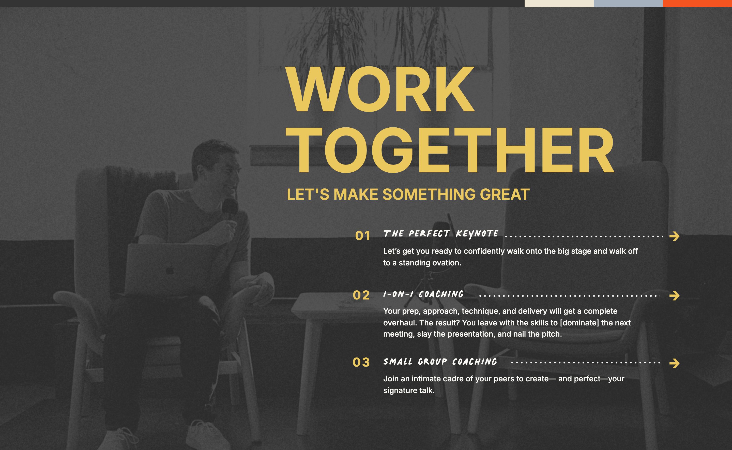
offer · bestspeech.co · bestspeech.co "WORK TOGETHER" band — gallery/_inbox/bestspeech.co/09.jpg (second polite pass, 2026-09-13); references/bestspeech.co/screenshots/desktop/07.webp
Band 885px; backdrop 960px tall (parallax), greyscale with a dot screen under a dark overlay, the person seated in the left half; "WORK TOGETHER" 120px/700 in #EAC85D on two lines, "LET'S MAKE SOMETHING GREAT" caps under it; three rows — 01/02/03 numerals and arrows in the accent, names in handwritten caps, 10px dotted leaders; a 14px four-colour stripe bar along the top edge.
added 2026-09-13

How it looks:

  • Desktop: a full-bleed photo fills the band under a dark scrim, its subject in the left half where no words go. Depth in two layers: the photo; and in the right half, top to bottom: the heading in caps at the largest scale in the band, in the accent, two lines, with a one-line subheading under it; then the offers as rows. Each row is a two-digit numeral at the left, the offer's name beside it, a dotted leader running from the name to the row's right end, and an arrow at the end as the link; under the name, indented past the numeral, a two- or three-line description. Row to row only the name, the leader's length and the description change. No button: the arrows are the actions.
  • Phone: the photo stays under the scrim; the heading and the rows stack at full width, the numeral kept at the left and the leader shortened to fit.

Fits: three to five offers with short copy; an environment row whose can says full-bleed 1440 with its subject in one half — without one, the band takes the ink as its ground and the rows sit in the same column; the direction hard-edged, contemporary or loud.

Not fit: one or two offers; long copy per offer; the direction warm or soft.

Object across the curved seamadopted · v14 — select-offer.md, a one-offer band; beside Closed rows that open (portrait left, words right) — here the object is the offer's own and enters from the band above

offer · jasminestar.com · jasminestar.com podcast band — bands 09 (from where the phone starts) and 10 of gallery/_inbox/jasminestar.com stitched (second polite pass, 2026-09-13; y6228–7608), because the object begins in the band above. The band also sets its one-word label as a ghost behind the words (the press entry's device); left out here — one idea per variant
Seam black → cream is an arc, y6430 at the edges and 6585 at the centre — the dark band hanging 155px into the light one; the phone mockup 375×750 at x~871–1246 / y6260–7010, 323px on black and 427 on cream; behind it "PODCAST" in the display face, 195px cap, white on #F9F5ED at 1.04:1, running under the phone; "THE JASMINE STAR SHOW" 38px caps, 3.8px tracking; heading 50px on five lines; body 21px in the right column under the phone; button 588×72 #A57E67 under the heading; the band 1,180px.
added 2026-09-13

How it looks:

  • Desktop: the band before is in the ink, this one is on the page ground, and the seam between them is a shallow arc, low at the centre, so the dark band hangs into this one like a curtain. The offer's object — tall, the thing the offer is: a device showing it, a cover, a product — stands in the right third, straddling the seam, its top on the dark band and more of it on the light one, in front of both. Flat, in the left column: the offer's name as small tracked caps; the heading at display scale on several lines; the page's button. The body sits in the right column under the object. The object is the largest thing in the band and the only thing that crosses.
  • Phone: the arc flattens but stays; the object, smaller and centred, still straddles it; name, heading, button and body stack in reading order.

Fits: one offer with an object of its own — a device, cover or product row tall column, can cut-out or on a plain backdrop; a band in the ink before it; the direction soft, warm, contemporary or photographic.

Not fit: an offer with no object, or only a portrait; two or more offers; the band before on the same ground; the direction hard-edged or empty.

Offers hung on a spineadopted · v14 — select-offer.md, beside Alternating photo and text bands (the same band; this is its second idea) and Numbered rows with leaders (a rule per row, horizontal)

offer · sarahjenks.com · sarahjenks.com "Want to dive in?" — the whole five-offer band from references/sarahjenks.com/screenshots/desktop/full.webp at 1× (y5144–10207), so the line reads end to end; the same band's first two offers at 2× are offer/alternating-photo-and-text-bands. Tiles 06–12. On the phone the line and discs are gone (mobile/09–10).
One hairline at x719–720, gold at reduced opacity — (198,188,175) on cream, 1.79:1 — from y5403 to y10206: 4,803px, ending one pixel above the first collage photo, with a short crossbar at its head under the heading. Five solid gold (165,125,79) 32px discs on it at y5500, 6435, 7371, 8371, 9371 — pitches 935, 936, 1000, 1000 — each near its offer's photo top, not its name. Text columns mirrored about the line, x151–562 and x871–1289; photos flush to the viewport edges on three offers; nothing crosses the line.
added 2026-09-13

How it looks:

  • Desktop: one long flat band on the page ground with a thin vertical rule running down its exact centre from under the heading to the band's foot — through every offer and the gaps between them, never broken, ending only where the next band begins. The offers hang off it left and right, alternating sides: photos on one side of the line, the words on the other, and a small solid disc sits on the line at each offer's top edge, like a station on a route, so the rule reads as a sequence and not a divider. The rule is a tint of the accent and stays quieter than the discs; the discs are the only solid marks of the accent in the band. Nothing crosses the line — the photos stop short of it on their side and the words start a margin past it on the other — so the centre of the page is empty but for the rule. The largest things are the photos; the rule is the longest line on the page.
  • Phone: the rule and the discs go; the offers stack in order at full width.

Fits: three or more offers that are a sequence or a set — stages, seasons, a path — each with its own photo and a name; an accent that reads as a hairline on the page ground; the direction classic, warm, soft or quiet.

Not fit: two offers; offers that are alternatives rather than a set; the direction dense or loud, where a hairline is lost.

Outlined frames stacked on the dark half of the photoadopted · v15 — select-offer.md, sits beside Two keyline plans and Numbered rows with leaders

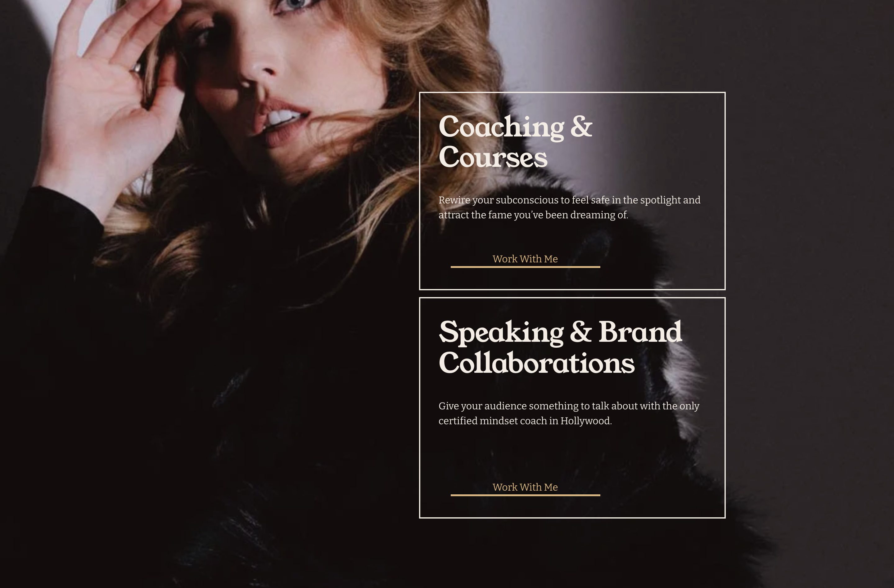
offer · howtobefamous.org · howtobefamous.org "Coaching & Courses / Speaking & Brand Collaborations" — band 06 of the 2026-09-13 sections capture (gallery/_inbox/howtobefamous.org/06.jpg, y4018–4966, no cut); references desktop/06.webp; phone from mobile/06.webp (y≈4280–5035 of the August mobile capture)
Band 948px; the photo full-bleed under no scrim, dark overall — the face upper left at x≈275–520, y0–290 with the crown cut by the top edge, fur and a dark backdrop filling the right half. Two frames of one width, x≈673→1168 (≈495px), y≈149→468 and ≈481→835, ≈13px apart, a ~1.5px cream stroke and no fill; inside each, ranged left, a ~48px display title on two lines, 18px body, and "Work With Me" as an 18px accent text link centred over a ~240px accent rule — the same link-over-rule the site uses for every button. Right margin ≈272px; nothing left of x≈673 but the photo. Mobile: the photo taller and still full-bleed; the frames stacked at ~340 of 390px, the first over the face.
added 2026-09-13

How it looks:

  • Desktop: one layer over another. At the back, a dark portrait fills the band edge to edge with no scrim; the face sits in the upper left corner, cut by the top edge, and the darkest mass of the picture fills the right half. In front, on that dark half, the offers as two outlined frames of equal width, stacked with a sliver of photo between, stroked in a hairline and unfilled, so the photo shows through each. Inside each frame, ranged left: the offer's name at display scale, a line or two of body, and the action, centred at the foot of the frame. Nothing lands on the face; the left half is the photo alone.
  • Phone: the photo taller; the two frames one under the other, nearly full width inside a small margin, still outlined and unfilled over the photo; the first lands on the face, since there is no dark half beside it any more.

Fits: a portrait row whose can says full-bleed 1440, dark in tone, with the face in one upper corner and a dark mass filling the other half — the frames need a dark field to sit on; two or three offers, each a name, a line and an action; the direction warm, loud or dense.

Not fit: a bright photo, or one with the figure centred; priced offers that want a table; more than three; the direction empty, quiet or typographic.

Phone and card straddling the video's footadopted · v15 — select-offer.md, a one-offer band; sits beside Object across the curved seam (jasminestar.com — one object straddling a curved seam from a dark band); here two things straddle a straight seam under a full-bleed video, and the card is one of them

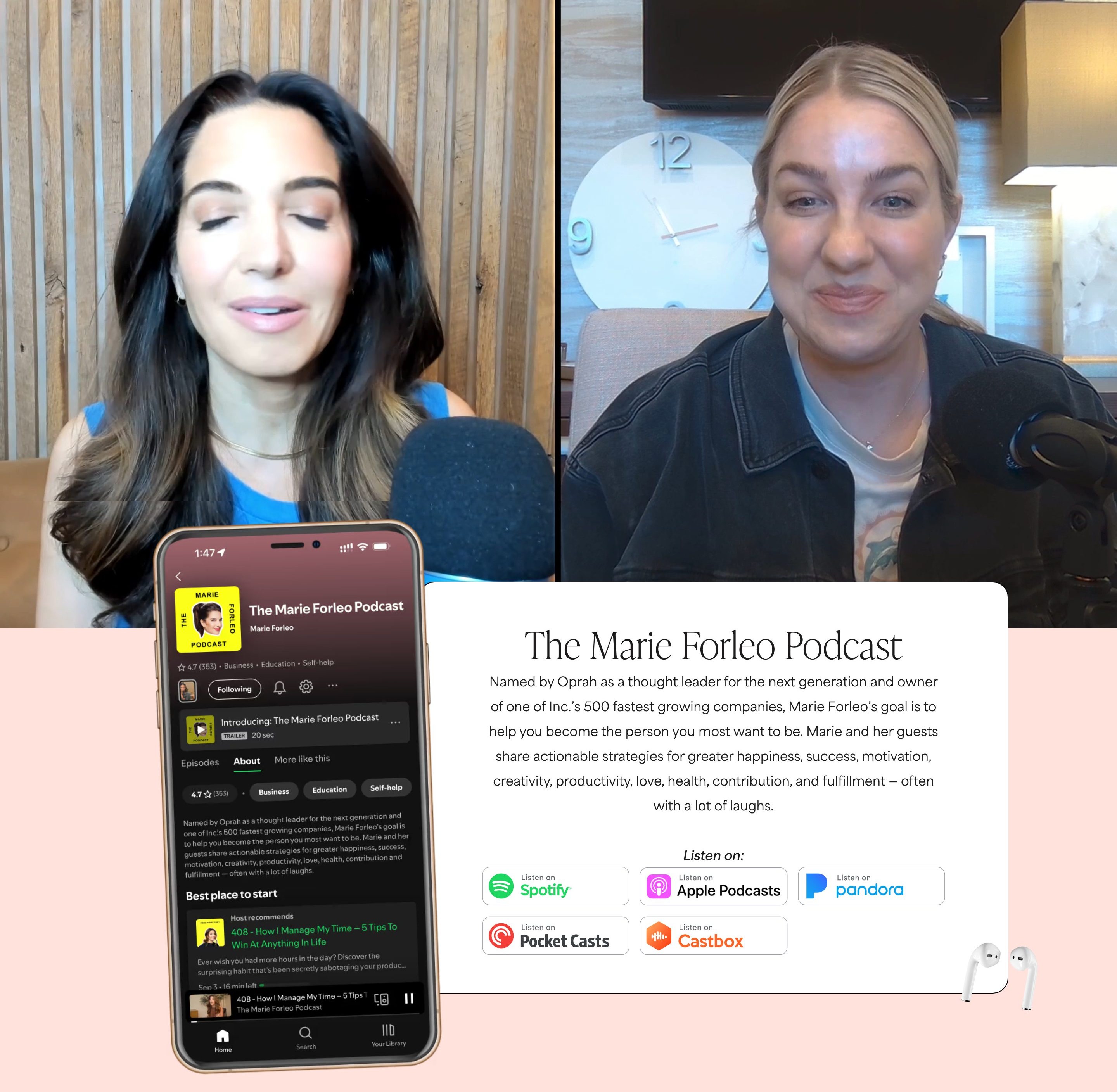
offer · www.marieforleo.com · marieforleo.com podcast band — gallery/_inbox/marieforleo.com/08.jpg (the video iframe, no words) and 09.jpg stitched (second polite pass, 2026-09-13; cut at y5400, inside the video — its frame continues 165px into band 09, and the phone and the card both begin in that stretch, on the video, before the tint starts); the fixed chat launcher was hidden in this capture. Phone from references/marieforleo.com/screenshots/mobile/08–09.webp.
Video iframe band y4754–5400 (646px), its frame running to y5565 where the pink #FFE2DC ground starts — a different frame per capture, solid black in the reference full.webp. White card x549–1299 (751 wide, ~10px radius) from y5505 to y6035 — 60px of card over the video. Phone mockup 380×722 at y5420 — 145px above the pink, ending 107px below the card's bottom. AirPods PNG 100×89 at y5968 on the card's right edge. Heading ~64px serif weight 200 centred; one 22px paragraph; "Listen on:" italic; five outlined tiles ~190×50 in a 3+2 grid. Numbers from references/marieforleo.com/analysis.md §7, checked against band 09. Mobile: the card's top still inside the video, tiles stacked full width, earbuds at the card's corner; the phone mock does not appear.
added 2026-09-13

How it looks:

  • Desktop: two grounds stacked: a full-bleed, wordless video of the show over a band in a tint of the accent, a straight seam between them. Two things hang from that seam, in front of both grounds. A device mock showing the offer stands in the left third, tall, its top well up inside the video, most of it on the tint. A card, lighter than the tint, holds the right two-thirds, its top edge crossing a little into the video; on it, centred: the offer's name at display scale, one paragraph, a label, and outlined tiles in two rows, one per platform. An accessory sits on the card's lower right corner, half on, half off. The video is the largest thing.
  • Phone: the video at full width; the card under it at nearly full width, its top still crossing into the video, the tiles stacked full width, the accessory at the card's corner; the device mock is dropped.

Fits: one offer with something to show — a show, a podcast, a course — with an environment or scene row whose can says full-bleed 1440 to stand above it and an object row tall column on a transparent ground for the device; a name of a few words, one paragraph, and two or more places to get it; the direction contemporary, warm, playful or photographic.

Not fit: an offer with no full-bleed row to hang from and no object of its own; two or more offers; the direction quiet, minimal or classic.

Photo squares with the names on themadopted · v14 — re-extraction of the v13 variant "Photo squares with the names on them" for select-offer.md

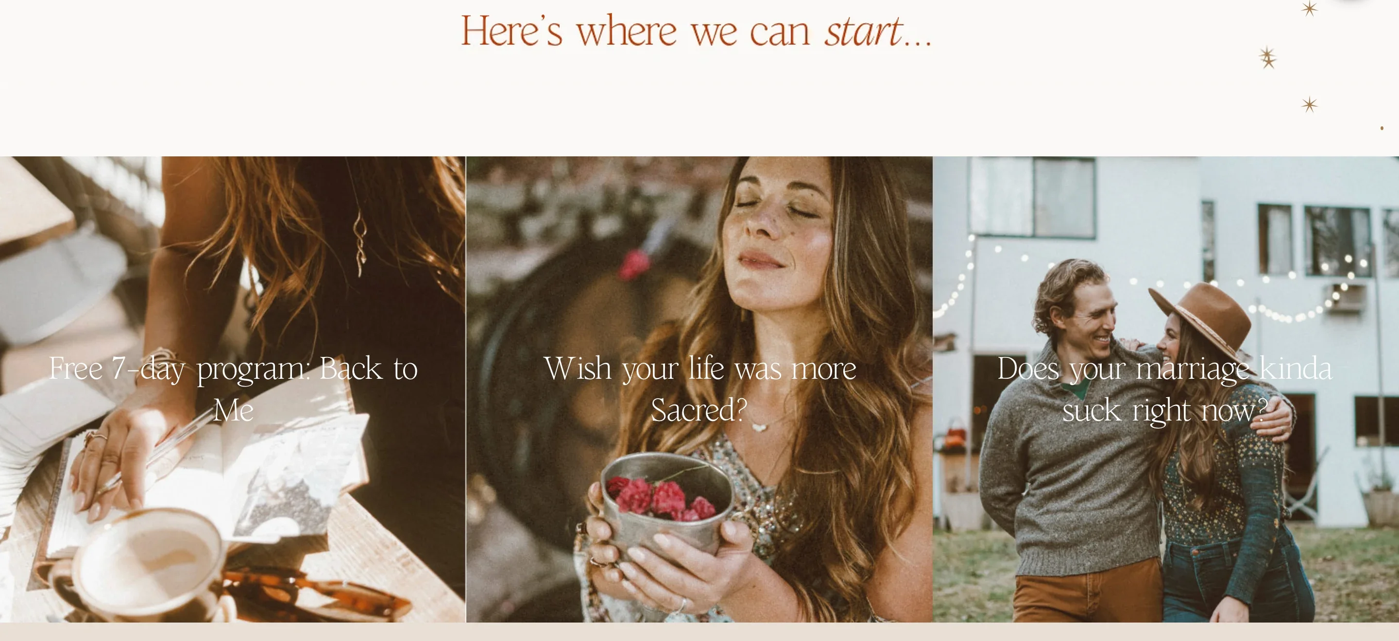
offer · sarahjenks.com · sarahjenks.com "Here's where we can start…" — references/sarahjenks.com/screenshots/desktop/03.webp (foot) and 04.webp, stitched; the 65px under 04's sticky header filled from full.webp. The v13 register's first source; jasminestar.com's 3-photo collage is its second. On the phone the squares stack at full width, titles still centred (mobile/05).
Three 480×482 photo squares (y2840–3322) flush to each other and to both viewport edges, no gutter; a white 36px title centred on each on two lines, no scrim, no button; the three labels under them ("Back to Me", "#SacredStart", "Online Course for Couples") are in the DOM at y3334 and paint nothing. A centred ~36px line in the accent with one italic word sits ~140px above the row on the cream; the row ends against the beige #E9DFD4 of the next band. The three photos share the page's grade — darkest 2% at L29–35, never black.
added 2026-09-13

How it looks:

  • Desktop: a row of squares, one per offer, filling the band edge to edge with no gutter — three squares, three photos, each filling its cell and flush against the next, so the row reads as one strip of pictures cut in thirds. Depth in two layers: the photo; and the offer's name centred on it in the ground colour at display scale, on two lines, with no plate or scrim under it — the photos are graded dark and warm enough for the words to read on their own. No eyebrow, no paragraph, no button on the squares: the square is the link. One short centred line on the page ground above the row introduces it, and the band below is a different ground, so the strip sits between two seams.
  • Phone: the squares stack at full width, each still square, the name still centred on it.

Fits: two to four offers each with its own photo row wide or near-square whose subject sits clear of the centre where the name lands, graded so a light word reads on it; names of two to six words; the direction photographic, warm or loud.

Not fit: one photo for all offers; photos with a bright or busy centre; names that need a paragraph beside them; the direction quiet, typographic or minimal.

Rows in the right half, the left emptyadopted · v15 — select-offer.md, sits beside Ruled table and Numbered rows with leaders

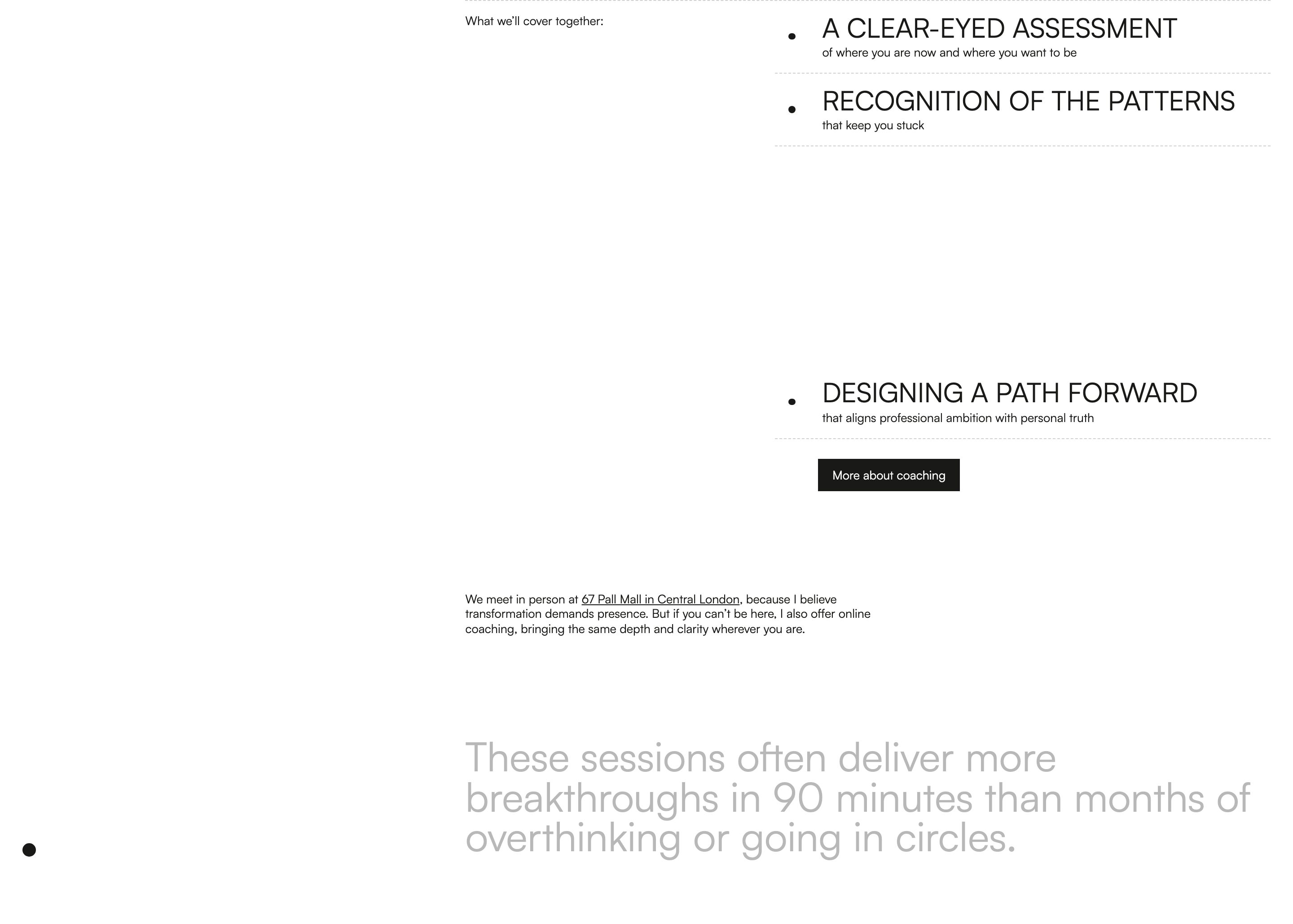
offer · www.kasiasiwosz.com · kasiasiwosz.com "What we'll cover together" — band 09 of the 2026-09-13 sections capture (gallery/_inbox/kasiasiwosz.com/09.jpg); reference tiles desktop/08–09. The gap between the second and third rows is a reveal-on-scroll caught mid-way, not the design. Phone not checked against a mobile tile.
Band 1029px, white. Label 16px at x≈518 top; nothing left of x≈518. Three rows from x≈880 to the right margin: a caps title ~36px over a one-line 16px subline, a 6px dot at the row's left, a dashed hairline under each in the ink at 20%. A solid 200×49px button under the rules, flush to the rows' left. A paragraph at x≈518 with the address as an underlined link; a 44.8px statement at the foot in a lighter ink. No boxes, no fills, no photos. The home page shows three rows.
added 2026-09-13

How it looks:

  • Desktop: flat, on the page ground. The left third of the band is empty. A small label sits at the top of the middle third. The offers hold the right half as rows: each row is a dot at its left, the offer's name in caps at display scale, a one-line description under it, and a hairline under the pair; the rows share their hairlines — no box, no fill, no photo. Row to row only the words differ. Under the last hairline, flush to the rows' left, the page's button. Below, back at the label's line, a short paragraph on a wide measure, and at the foot a long statement at display scale, the largest thing in the band.
  • Phone: the empty third goes; the label, the rows, the button, the paragraph and the statement stack at full width in that order, the hairlines kept.

Fits: three to five offers with a name and one line each; an offer beat with no photo to show — nothing from the Assets table enters the band; a closing statement of one sentence; the direction quiet, empty, typographic or classic.

Not fit: offers with a paragraph each; an offer beat that needs its photos; the direction dense, warm or loud, where the empty third reads as unfinished.

Ruled tableadopted · v14 — re-extraction of the v13 variant "Ruled table" for select-offer.md

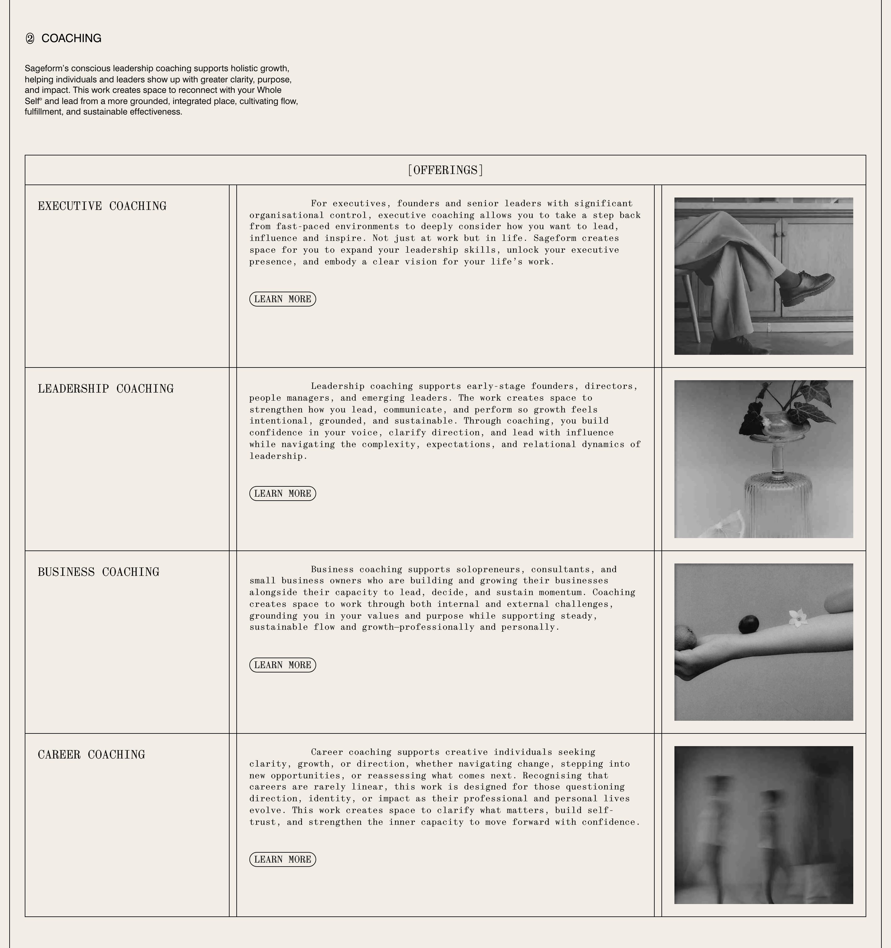
offer · sageformstudio.com · sageformstudio.com "Coaching" offerings — band 04 of gallery/_inbox/sageformstudio.com (2026-09-13); the v13 source
One 1358px box with 1px rules in the ink; a header cell 48px tall with "[OFFERINGS]" centred; four rows of name | body | 289×254 greyscale plate, sharing their rules, no gap; body 15px mono with a ~100px first-line indent held identical on mobile; one outline pill per row under the body; a circled-numeral label and a 5-line intro at the top left; band 1531px; on a phone each row re-orders to photo → name → body.
added 2026-09-13

How it looks:

  • Desktop: flat, on the page ground. A small label and a short intro paragraph at the top left, in a narrow column. Under them one box ruled in the ink, the band's full width, holding the offers as a table: a header row across the whole width with a label centred in it, then one row per offer. Each row is three cells divided by rules — the offer's name at the left, the body in the middle with the page's button under it, a small photo plated in the right cell, all the photos the same size and the same treatment. The rows share their rules: no gap, no box per offer, no fill, no radius. The name cell and the photo cell are narrow; the body cell is the widest. Item to item only the words and the photo differ. The largest thing is the box itself; the type stays small throughout.
  • Phone: the table keeps its rules and each row re-orders — photo, then the name, then the body and the button — in one ruled column.

Fits: three or more offers with a paragraph each; a work, environment or detail row per offer that reads small — the photos are plates in a ledger, not features; the direction quiet, classic, hard-edged or empty — hairlines do the page's structure.

Not fit: two offers; offers with no body copy; the direction loud or soft; a page whose other bands already draw boxes.

Section name across the seamadopted · v14 — select-offer.md, a one-offer band; beside Alternating photo and text bands (which is what the band is under the name, once); the only v13 variant with a word across a seam is the hero's

offer · jasminestar.com · jasminestar.com speaking band — bands 07 (from where the name starts), 08 and 09 of gallery/_inbox/jasminestar.com stitched (second polite pass, 2026-09-13; y4505–6428), because the name begins in the band above; the phone entering at the foot belongs to the next band (offer/object-across-the-curved-seam)
"SPEAKING" 1199×191 in the display face, white, at y4542–4732 across the photo → black seam at y4695 — 153px on the photo, 37 on black; the stage video ~938×570 at x432–1370 with ~40px corner radii, plated on black, right of centre; H2 62px centred on three lines; a centred 22px paragraph; two 516px body columns with a 116px gutter; button 441×71 #EFE8DB, an arrow after the label, bottom left. Mobile: "SPEAKING" at 63px cap bleeds off both edges and sits 102px below the photo edge rather than across it.
added 2026-09-13

How it looks:

  • Desktop: the band before ends in a darkened photo and this band is in the ink. The offer's one-word name, the largest type on the page, in the ground colour, is set across the seam between them — most of the letters on the photo, their bottoms on the ink band — nearly the full width of the screen, so the seam runs through the word and the word announces this band from inside the one before. Under it, flat on the ink: the offer's picture, a wide frame of the person at work, plated with soft corners, right of centre and touching no edge; the heading at display scale centred on a few lines; one short centred paragraph; the body in two columns; the page's button under the first column.
  • Phone: the name too wide for the screen, clipped at both edges, sitting just under the photo instead of across the seam; picture, heading, paragraph, columns and button stack in reading order.

Fits: one offer with a one-word name; an environment or action row wide that reads at about two thirds of the band's width; a band before it that ends in a photo or a scrim; the direction loud, typographic or photographic.

Not fit: an offer named in more than two words; two or more offers; a band before it on a flat ground of the same colour; the direction quiet.

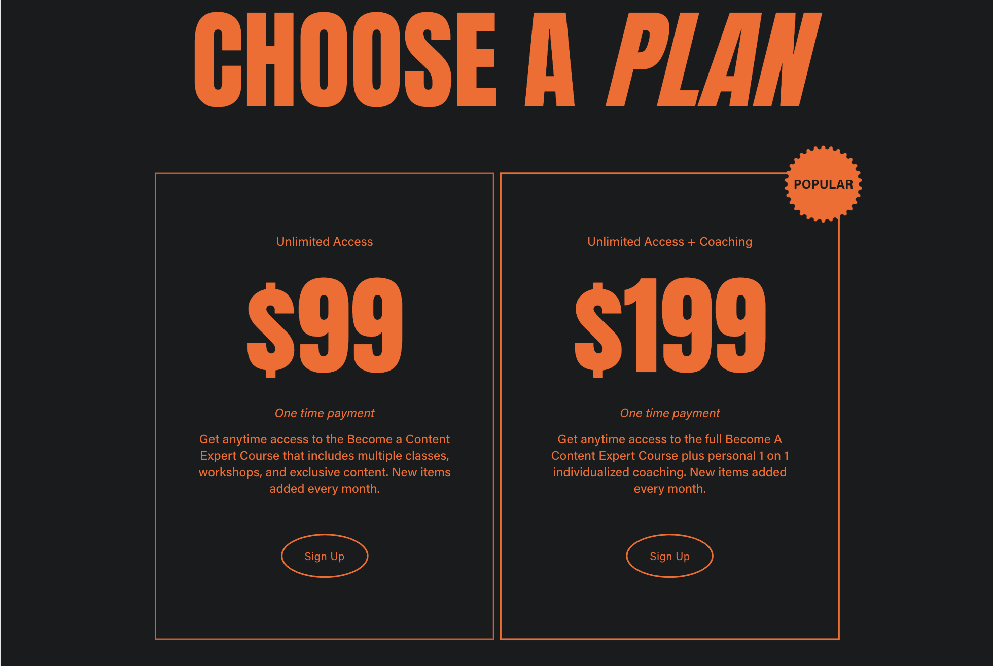
Two keyline plansadopted · v14 — select-offer.md; it is the identical-box row the prompt refuses today (priced offers)

offer · forma-fluid-demo.squarespace.com · Squarespace "Forma" template demo, pricing; screenshot from Andrew 2026-09-13
Heading ~180px caps with one italic word; two boxes ~670px wide with a 2px orange keyline and no fill; $99 / $199 at ~200px; a "POPULAR" starburst stamp overshooting the top-right corner; outline pills.
added 2026-09-13

How it looks:

  • Desktop: flat, on the page ground. A heading, the largest type on the band, centred at the top. Under it the offers as equal keyline boxes in one row, stroked in the accent with no fill; inside each, centred and top to bottom: the name, the price as the largest thing in the box, the period, a short description, and the action. The boxes are identical; the marked one carries a round stamp overshooting its top corner.
  • Phone: the boxes stack in order, each full width.

Fits: two or three priced offers, each with a name, a price, a period and a description; the direction hard-edged or loud.

Not fit: offers without a price; more than three; the direction soft.