hero · 13

Edgeless portrait on the page groundadopted · v15 — select-hero.md, sits beside Portrait bleeding off an edge

hero · www.interior-self.com · interior-self.com hero — references/interior-self.com/screenshots/desktop/01.webp, the whole band (y60–889) under the fixed header; the accent strip at the foot of the tile is the next band's marquee, not part of this variant. Phone: mobile/01.webp, which shows the portrait and the headline on it; the paragraphs sit below the first screen.
Hero 829px. Portrait 434×709 at (948,100), right edge x1382, 58px inboard of the viewport; its backdrop (239,239,237) on a page ground of (246,244,240). H1 81px serif on two lines; two paragraphs ~40px; one italic line ~20px. No button in the band — the only pill is the header's CONTACT. Phone: portrait full-width, the headline over its lower half at the left.
added 2026-09-13

How it looks:

  • Desktop: flat, on the page ground, under the nav. The band splits in halves. The words hold the left half, left-aligned: the headline on two lines at display scale, the largest thing in the band; under it two short paragraphs set almost as large; then one small line. No button; the action is the nav's. The portrait holds the right half, standing inboard of the right edge and clear of the band's foot, edgeless: the photo's backdrop is within a shade of the ground, so no rectangle reads and the person appears to sit on the page itself. Nothing crosses; each half keeps to itself.
  • Phone: the portrait first, edge to edge and tall, still edgeless; the headline lands on its lower half at the left; the paragraphs and the small line stack under it.

Fits: a portrait row tall column, shot on a plain seamless backdrop, can edgeless — the ground takes the backdrop's colour or comes within a shade of it; the subject seated or full-length and clear of the frame's edges; a headline of a few words and two sentences short enough to set large; the direction warm or contemporary.

Not fit: a portrait on a busy or dark backdrop, or one already cut to a shape — the rectangle would read and the idea is gone; a ground far from the backdrop's colour; a long description; a page that needs its action on the first screen; the direction dense or typographic.

Headline across two photosadopted · v14 — beside Lockup crossing the plate in select-hero.md

hero · forma-fluid-demo.squarespace.com · Squarespace "Forma" template demo, hero — the strip reads Squarespace's placeholder "It all begins with an idea"; screenshot from Andrew 2026-09-13
Two plated photos, ~430×775 left and ~520×330 right; three-line caps italic headline in orange on near-black; one outline pill; a marquee strip under the band.
added 2026-09-13

How it looks:

  • Desktop: a dark band the height of the screen. It has depth in four layers: the ink; two photographs plated straight on it, one tall at the left sitting high and touching no edge, one wide at the right sitting low and running off the right edge; the headline in caps, the largest type on the page, centred across the band in front of both photos, its first line crossing the tall photo and its last line crossing the wide one; and the action centred under the headline.
  • Phone: the tall photo first, the headline crossing its lower edge, the action, then the wide photo.

Fits: two photo rows, one tall column and one wide, their subjects away from where the words cross; a headline of a few words; the direction loud, hard-edged or typographic.

Not fit: one photo; the direction quiet or soft.

Headline echoed off both edgesadopted · v14 — beside Headline huge across the photo in select-hero.md

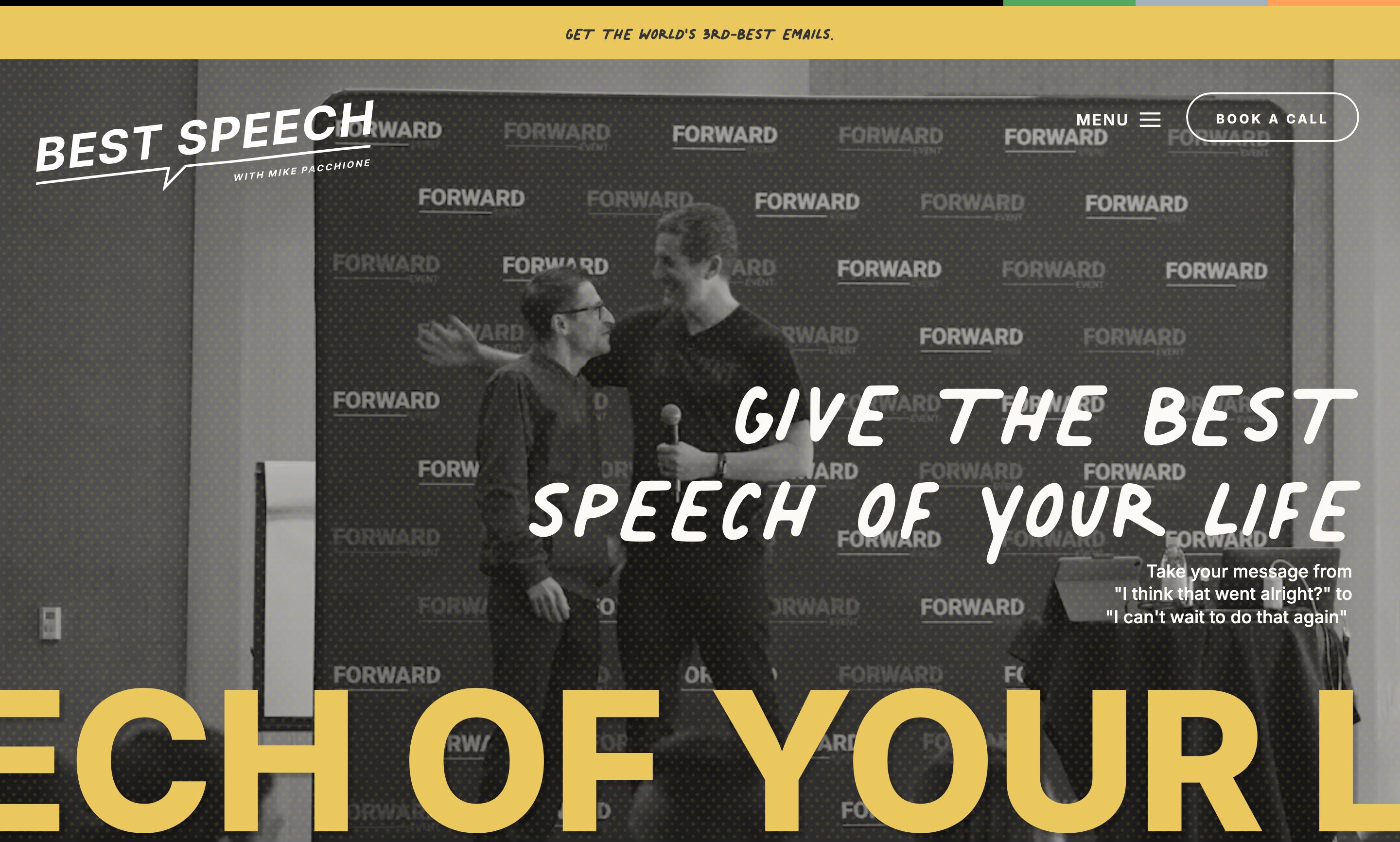
hero · bestspeech.co · bestspeech.co hero — gallery/_inbox/bestspeech.co/01.jpg (second polite pass, 2026-09-13); references/bestspeech.co/screenshots/desktop/01.webp
Band 866px; greyscale photo with a dot screen under a dark overlay; H1 140px right-aligned in a 948px box, glyphs y396-559; the echo line cap height 148px (y708-856) in #EAC85D, reads "ECH OF YOUR L", baseline 10px above the band edge, cut by both viewport edges; 53px yellow announcement bar above the nav; MENU + a 3px outline pill at the right; tilted speech-bubble wordmark at the left.
added 2026-09-13

How it looks:

  • Desktop: a full-bleed photo fills the first screen under a dark scrim, its people towards the left half. It has depth in three layers: the photo; the headline, two lines right-aligned against the right edge in the lower half, in front of the photo, with one short line of body on the same right edge under it; and, along the bottom edge, the headline again in caps at several times its size, in the accent — one line so wide that only a few letters from its middle land on screen, running off the left edge and the right edge, its baseline flush to the band's bottom edge, which cuts it. Nobody reads the echo in full; it is a texture that says the same thing louder. The nav runs in one row across the top, the mark at the left and the action at the right.
  • Phone: the photo fills the screen, the headline and its line in the lower half at full width; the echo stays one line along the bottom edge, still running off both sides, fewer letters on screen.

Fits: a hero or environment row whose can says full-bleed 1440, its subject in one half so the words own the other; a headline of a few words with a phrase worth shouting; the direction loud, hard-edged or typographic.

Not fit: the direction quiet or classic; a headline that is a sentence and loses its sense as a fragment; a photo whose subject fills the frame.

Headline huge across the photoadopted · v14 — rewritten from the v13 variant

hero · www.marieforleo.com · marieforleo.com hero — references/marieforleo.com/screenshots/desktop/01.webp, the whole band (y66–876) with the nav band above it and a strip of the next band; the frame under the scrim is a background video and differs capture to capture — this tile caught her holding a book on a TV set; the chat launcher prints bottom-right over the "Watch Video" link in every desktop tile. Phone: mobile/01.webp. The v13 register's primary source.
Band 1440×810 under a white 66px nav band; a background video with no poster image under rgba(0,0,0,0.7) — brightest non-text pixel 73/255. H1 120px/132px serif weight 400 in a 950px centred box, two lines, white; the last word italic #FFCAC7 with a 12px underline the word's width. No paragraph and no button in the band — one "Watch Video" h5 text link at the foot (under the launcher on desktop) and a chevron. The subject stands centred behind the headline: face above line one, torso behind line two. The about band's 136px "I'M MARIE." outsizes the H1, so it is the largest type on the screen, not the page. Phone: H1 60px on three lines, hero 674px, the link bottom-right with a play glyph. v13's What line says "across the photo's empty half" and "one line of description and the page's button under it, still on the photo" — the source crosses the subject under a scrim and carries neither a description nor a button.
added 2026-09-13

How it looks:

  • Desktop: a photo filling the band edge to edge, the height of the screen, darkened under a scrim until it reads as a backdrop rather than a picture. Depth in three layers: the photo; the scrim; and the headline in front, two lines in the ground colour, centred on the band both ways, the largest thing on the screen and wider than the person behind it. The person stands centred behind the words, face clear above the first line, body crossed by the second — the scrim is what makes that crossing safe. Nothing else lands on the photo but a small text link at the foot. The nav sits in its own band above the photo, not on it.
  • Phone: the photo fills the width; the headline on three lines, still centred on the photo and crossing the person; the link at the foot.

Fits: a portrait or scene row whose can says full-bleed 1440, the subject centred and standing, the frame busy or plain — the scrim covers either, so the caption need not name an empty half; a headline of a few words that breaks into two lines; the direction loud or photographic.

Not fit: a row needs a ground or small; a portrait whose face is the point, which the scrim would dull; the direction quiet, soft or empty.

Headline on the dark part of the photoadopted · v15 — select-hero.md, sits beside Headline huge across the photo

hero · howtobefamous.org · howtobefamous.org hero — references/howtobefamous.org/screenshots/desktop/01.webp, the whole band (y0–859) with a strip of the next band at the foot. Phone: mobile/01.webp.
Photo 1201×1800 intrinsic, cover-fitted to 1440×859, no overlay; the figure upper right, the darkest mass (the jacket) low and central. H1 64px display serif weight 400 on four centred lines, cream, the page's largest type (a 61px display line is next); eyebrow ~36px above it; two text links with arrows over two 241px rules, 12px apart, under it; no button. Nav in one row on the photo: logo left, five links right. Phone: the headline on six lines climbs over the face; the two links stack, each over its own rule.
added 2026-09-13

How it looks:

  • Desktop: one layer over another. At the back, a photo fills the band edge to edge with no scrim; the figure is in the upper right with the face clear, and the darkest mass of the picture sits low and central. The nav runs in one row across the top of the photo. In front, centred on that dark mass so the light ink reads without a veil: a small eyebrow line, the headline on four centred lines at display scale, the largest type on the page, and under it two text links side by side, each with an arrow, each over a short rule. No button. The words sit low in the band, below the face, never on it.
  • Phone: the photo taller, the nav collapsed; the eyebrow, the headline and the links stack centred, the links one under the other on their rules; the headline climbs over the face, because the dark part is no longer tall enough.

Fits: a portrait row full-bleed with a dark mass low in the frame and the face clear of it — the words need somewhere dark to land without a scrim; a headline of one sentence; two secondary links rather than one button; the direction warm, loud or dense.

Not fit: a bright or evenly lit photo, or one whose dark part is under the face; a page that needs one solid button on the first screen; the direction empty or quiet.

Lockup crossing the plateadopted · v14 — re-extraction of the v13 variant "Lockup crossing the plate" for select-hero.md

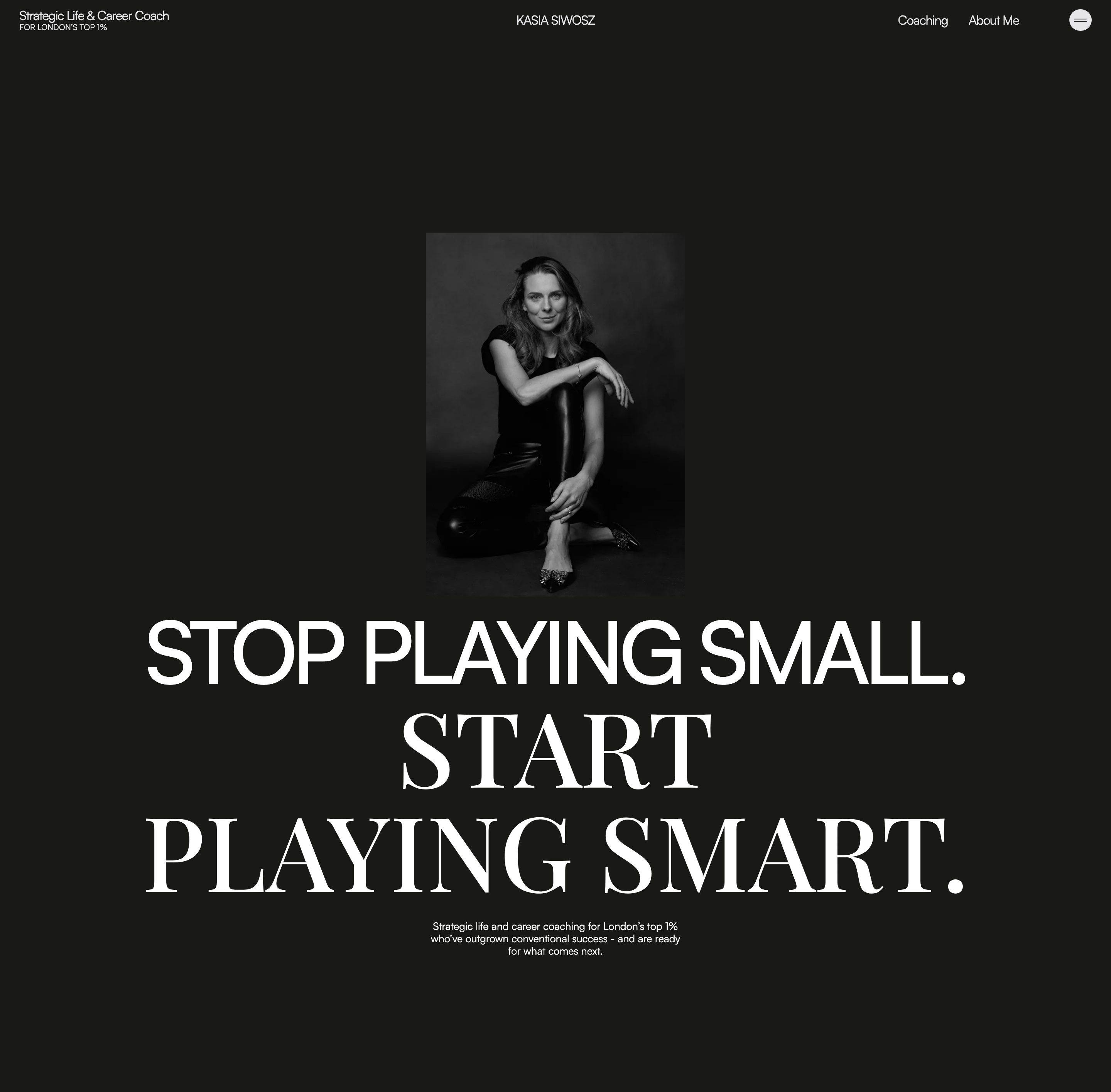
hero · www.kasiasiwosz.com · kasiasiwosz.com hero — band 01 of the 2026-09-13 sections capture (second polite pass, authorised by Andrew); reference tiles desktop/01–02, mobile/01 for the phone shape
Band 1415px. Portrait plate 336×471 CSS px, centred, no radius, no shadow, a dark studio backdrop close to the band's #191917. Lockup three centred lines: line 1 grotesk caps, cap height 83px; lines 2–3 didone caps, cap height 101px; lines 1 and 3 width-matched to within 0.5px (x 192→1250 / 189→1247). Lines 2–3 overlap the lower half of the plate. Paragraph three lines, centred, ~430px measure. Phone: plate at the top, lockup fully beneath it, line 1 blurred. v13's What line says "off-centre" and "crossing by about a third" — the source is centred and the crossing runs the plate's whole width.
added 2026-09-13

How it looks:

  • Desktop: a dark band, taller than the screen, whose ground is close to the portrait's own backdrop, so the plate's rectangle reads only where the light falls on the person. Depth in three layers: the ground; a small portrait plated straight on it, centred on the page's axis, the person full-length, touching no edge, sitting in the upper half; and the headline in front, centred on the same axis — three lines of caps in two faces, the first line in one and the next two in the other and larger, the largest type on the page, wider than the plate on both sides. Its lower two lines cross the lower half of the plate, so the person's legs sit behind the words and the face stays clear above them. The first and last lines are set to the same width. A short paragraph, centred in a narrow measure, sits under the headline; the nav runs in one row across the top.
  • Phone: the plate at the top of the band at nearly full width; the headline entirely beneath it, no crossing; the paragraph below.

Fits: a portrait row tall column, full- or three-quarter-length, whose caption names a plain backdrop the ground can match, the subject centred with the lower part of the frame free to sit behind words; a headline of a few short words that breaks into two or three lines, with a turn in it the second face can mark; the direction typographic, hard-edged or quiet.

Not fit: a headshot, or a portrait whose subject fills the frame edge to edge so the words would cross the face; a busy backdrop; a one-line headline; the direction soft or photographic.

Name across the foot, in front of the figureadopted · v15 — select-hero.md, sits beside Name behind the figure and The name as the first screen

hero · roxienafousi.com · roxienafousi.com hero — references/roxienafousi.com/screenshots/desktop/01.webp, the whole first screen (y0–900). Phone: mobile/01.webp. A cookie badge prints bottom-left of both; a device, not the pattern.
Photo 2200×1485 cover-fitted to 1440×900, true greyscale, no scrim, the figure in the right half. The name is outlined vector lettering, cap height 150px, ink x29–1409.5, cap band y714–864, no h1 on the page. The sentence ~23px bold caps on two lines centred at y≈610–650. No nav in the first screen; nothing clickable in the band. Phone: the sentence on three lines at mid-height, the name on one line across the width at the foot.
added 2026-09-13

How it looks:

  • Desktop: one layer over another. At the back, a photo fills the whole first screen edge to edge, greyscale and without a scrim, the figure standing in the right half and the left half open. In front of it, two pieces of type only. At mid-height, one sentence in small, tracked caps, centred on two lines, landing on the open half and crossing onto the figure. At the foot, the person's name in one line running from the left edge to the right edge, the largest type on the page, in front of the photo so the figure's legs pass behind the letters; its base sits just above the bottom edge. No nav on this screen and no button.
  • Phone: the same, taller: the sentence on three lines at mid-height, the name on one line across the foot, smaller but still edge to edge.

Fits: the brand is the person's name, short enough to set across the width on one line; a portrait row full-bleed, can greyscale, landscape, with the figure to one side and open ground on the other for the sentence; one sentence of positioning; the direction quiet, hard-edged or typographic.

Not fit: a business name, or a long one that would wrap; a portrait cropped tight or square, with no open ground beside the figure; a page that needs its nav or its action on the first screen; the direction soft or dense.

Name behind the figureadopted · v14 — beside The name as the first screen in select-hero.md

hero · jennakutcher.com · jennakutcher.com hero — culled reference, references/jennakutcher.com/screenshots/desktop/01.webp
Name ~250px in a didone, cut-out portrait covering "tch"; the sentence in two blocks 68px apart; eight nav links, no logo; "AS SEEN IN" with one cycling mark; a seal on the seam.
added 2026-09-13

How it looks:

  • Desktop: the first screen is one flat colour, the photo's own backdrop, so the person has no rectangle around her. It has depth in three layers: the ground; the person's name on two lines, the largest type on the page; and the person in front of it, centred, three-quarter length, running off the bottom of the screen and hiding part of her own name, which still reads. The headline is one sentence broken into two blocks, one each side of the figure at different heights, one word of each in the accent. The nav runs in one row across the top with no logo, because the name is the logo; the action is the nav's.
  • Phone: the name on two lines at full width, the figure under it at full width, the sentence in one block below.

Fits: the brand is the person's name; a portrait row tall column whose ground is transparent or whose caption names a plain backdrop of one hue; the direction loud or typographic.

Not fit: the brand is a business name; the portrait's backdrop is busy; the direction quiet.

Photo in the left half, the lockup for a headlineadopted · v15 — select-hero.md, sits beside Portrait bleeding off an edge

hero · thevibranttapestry.com · thevibranttapestry.com hero with the nav strip the cutter joined to it — band 01 of gallery/_inbox/thevibranttapestry.com (2026-09-13 sections capture, second polite pass approved by Andrew); the phone from references/thevibranttapestry.com/screenshots/mobile/01.webp
Band 01 y0–898. Nav strip ~86px on plum #572F30 with a round 'TVT' seal at the left, five links and a filled 'Get Started' at the right. Photo x0→720 of 1440 (exactly half), y~86→898, no radius, an older woman in a cream cardigan turned toward the right; right half on #EAE1D5. Lockup 'THE VIBRANT TAPESTRY' ink x~817→1177, y~306→450 — 'THE' ~24px ruled above and below, the name ~60px serif caps on two lines, a rule under the second — the largest type on the page; the h1 is the ~20px tracked-caps line on three lines at y~490→580 beneath it; 'Book a Consultation' ~210×45 filled terracotta at y~634; a palm-leaf line drawing x~1044→1440, y~461→898 runs off the right edge and the foot; nothing crosses x720. Phone: the photo full width under the strip, the lockup and the h1 centred beneath it.
added 2026-09-13

How it looks:

  • Desktop: flat, in halves under the nav's own dark strip. The left half is the photo, full-bleed on that side: flush to the strip above, the left edge and the foot, no radius, the subject turned toward the words. The right half is the page ground, and where a headline would go sits the brand's lockup as the logo row shows it, at display scale, the largest thing on the band; there is no headline sentence. Under it the description in small tracked caps on three lines, then the button, all ranged left on one axis in the half's middle. Nothing crosses the midline; the photo and the words each keep to their half.
  • Phone: the photo first at full width under the strip, flush to both edges; the lockup, the description and the button stack under it on the page ground, centred.

Fits: a logo row that reads at display scale — a lockup or a wordmark, not a mark alone; an environment or portrait row tall column or squarer, the subject facing one side so they can look toward the words; a description of one line; the direction warm, classic or photographic.

Not fit: a mark that only reads small, or a person's-name brand with no lockup, where the name would have to be set as type; a headline that must carry an argument; the direction typographic, empty or hard-edged.

Portrait bleeding off an edgeadopted · v14 — rewritten from the v13 variant

hero · jamiercox.com · jamiercox.com hero — references/jamiercox.com/screenshots/desktop/01.webp; the tile holds the nav and the band (y150–904) bar its last 4px of padding. Phone: mobile/01.webp. The v13 register's primary source.
Band 754px on bone #f9f2e8. Portrait 634×604 at x0 with `border-radius: 0 500px 500px 0` — square on the left where it leaves the viewport, a true semicircle on the right, a D; y≈225–830, clear of the band's top and foot. Text column from x≈734: H1 56px/60px sans, two lines, left-aligned, vertically centred on the portrait; description 22px/32px on two lines; the action an italic 30px phrase over a rule 10px under it with a 24×29 star — the site has no filled button. The nav wordmark (~100px) outsizes the H1; a black square badge bleeds off the top-right corner. Phone: the D holds at 390 (the radius clamps to a semicircle), the portrait first at full width, the H1 on four lines under it. v13's What line describes the source; its "the headline large on the ground" overstates it — the headline is the third-largest thing on the screen after the wordmark and the portrait.
added 2026-09-13

How it looks:

  • Desktop: flat, on the page ground, the nav in one row across the top. Below it the band splits in halves. The portrait holds the left half, flush to the left edge and running off it: its outer side is square where it leaves the screen and its inner side a full half-round, so it reads as a D pressed against the edge; it touches neither the top nor the foot of the band. The words hold the right half, left-aligned and centred on the portrait's height, top to bottom: the headline on two lines at display scale, a short description, and the action as the last line. Nothing crosses; the photo and the words each keep to their half.
  • Phone: the portrait first at full width, still flush to the left edge with its half-round on the right; the headline, description and action stack under it.

Fits: a portrait row tall column or squarer, head and shoulders, the subject near the frame's centre and clear of the side the curve takes; a headline of a few words; the direction soft, warm or contemporary.

Not fit: a row small, or one already cut to a circle; a full-length figure, which the half-round would crop; the direction hard-edged or typographic.

The name as the first screenadopted · v14 — rewritten from the v13 variant

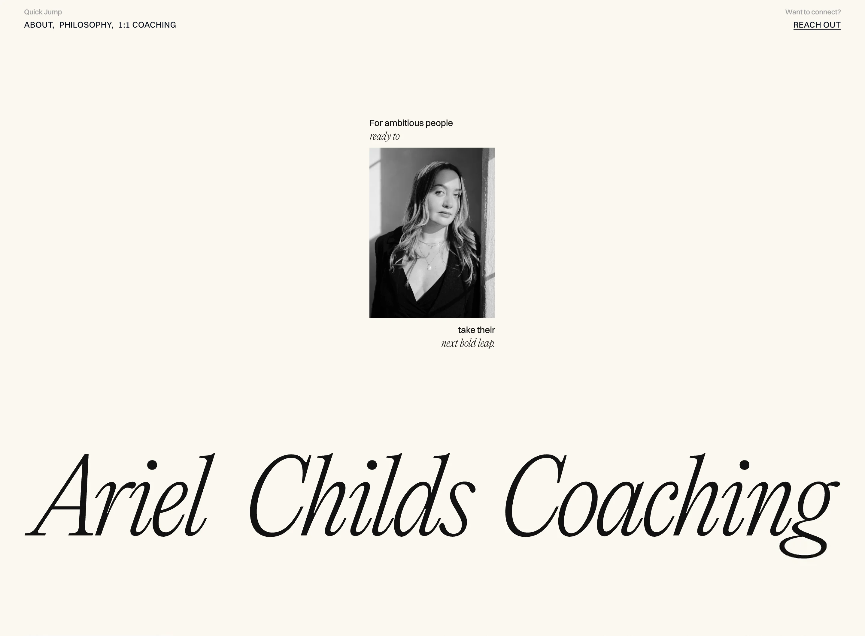
hero · www.arielchilds.com · arielchilds.com hero — references/arielchilds.com/screenshots/desktop/01.webp with the strip y900–1060 stitched under it from desktop/full.webp (dpr1, upscaled ×2), because the wordmark's descenders fall past the tile's foot and tile 02's head carries the fixed nav painted over them; the seam at y900 is a change of resolution. Phone: mobile/01.webp. The v13 register's primary source.
Band 1060px on cream #fbf7f0. Portrait 209×284 greyscale at y246, centred (x615–824 in 1440); four text lines of 15–17px in two faces, alternating, in 209px boxes — the two above left-aligned, the two below right-aligned. Wordmark ink x41–1398 (1357px of 1440), y755–930, ultralight italic didone, cut by the 900px fold; it is not an h1. Nav: two small text groups at the corners, no logo until the wordmark scrolls away. No button — REACH OUT in the nav is the only action; at 1440×900 the first viewport is ~86% empty. v13's What line sets the name "behind the portrait or crossing it" and puts "one line of description and the page's button under" — the source sets the name wholly below the column, wraps the description around the portrait, and has no button.
added 2026-09-13

How it looks:

  • Desktop: flat, on the page ground, and mostly empty. The nav is two small text groups at the top corners, no logo. Dead centre of the screen a narrow column: a small greyscale portrait plated on the ground, with the headline broken around it — two short lines above the photo set to its left edge, two below set to its right, so the sentence reads down one side, jumps the portrait and lands on the other. Under the column, at the foot of the first screen, the person's name runs edge to edge across the band, the largest type on the page, sitting so low that the fold cuts its feet. No button: the action is the nav's.
  • Phone: stacks the same way; the column widens to the phone's width and the name stays on one line across the foot, smaller.

Fits: the brand is the person's name; a portrait row small or tall column on a plain ground, greyscale so it sits quiet; a headline that is one short sentence, breakable into four lines of two or three words; the direction empty, quiet or typographic.

Not fit: the brand is a business name; a long headline; a page that needs its action on the first screen; the direction dense or loud.